
%load_ext autoreload
%autoreload 2
Mastering Archetypal Analysis Visualization#
Welcome to this comprehensive visualization tutorial for Archetypal Analysis! While archetypal analysis produces powerful mathematical results, the real insights come from effective visualization of the discovered patterns.
Why Visualization Matters in Archetypal Analysis#
Archetypal analysis generates three key types of coefficients that can be challenging to interpret numerically:
Mixture coefficients: How each data point mixes the archetypes
Archetypal Mixture coefficients: How archetypes are built from original data
Archetypes themselves: The extreme “pure types” discovered
This tutorial focuses on two powerful visualization tools:
Simplex plots: Geometric representation of data points in archetypal space
Stacked bar charts: Composition view showing archetypal mixtures
Let’s dive into creating compelling visualizations that reveal the hidden archetypal structure in your data!
import numpy as np
import matplotlib.pyplot as plt
from sklearn.datasets import load_iris
from archetypes import AA
from archetypes.visualization import simplex, stacked_bar, set_cmap, get_cmap
from archetypes.datasets import sort_by_archetype_similarity

# Set up our data and model
iris = load_iris()
X = iris.data
feature_names = iris.feature_names
target_names = iris.target_names

print(f"Dataset: {X.shape[0]} flowers × {X.shape[1]} features")
print(f"Species: {target_names}")
Dataset: 150 flowers × 4 features
Species: ['setosa' 'versicolor' 'virginica']
Setting Up Our Archetypal Analysis Model#
Before we dive into visualizations, let’s train a model on the Iris dataset and extract the key coefficients we’ll be visualizing.
# Train archetypal analysis model
model = AA(n_archetypes=3, random_state=42, max_iter=1000)
model.fit(X)

# Extract key results
archetypes = model.archetypes_
coefficients = model.coefficients_  # Mixture coefficients
arch_coefficients = model.arch_coefficients_  # Archetypal Mixture coefficients

print(f"✅ Model trained successfully!")
print(f"📊 Final reconstruction error: {model.rss_:.4f}")
print(f"🔄 Iterations: {model.n_iter_}")
print(f"\n🎯 Results summary:")
print(f"   Archetypes shape: {archetypes.shape}")
print(f"   Coefficients shape: {coefficients.shape}")
print(f"   Archetypal mixture coefficients shape: {arch_coefficients.shape}")
✅ Model trained successfully!
📊 Final reconstruction error: 25.2730
🔄 Iterations: 48

🎯 Results summary:
   Archetypes shape: (3, 4)
   Coefficients shape: (150, 3)
   Archetypal mixture coefficients shape: (3, 150)
🎨 Customizing Color Schemes#
Before creating visualizations, let’s explore how to customize color schemes. The archetypes.visualization module provides utilities for consistent, beautiful color schemes across all plots.
Available Color Controls:#
set_cmap(): Set global colormap for all visualizationsget_cmap(): Get current colormapIntegration with
pypalettes: Access professional color schemes
Let’s try a few different color schemes:
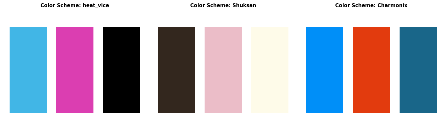
from pypalettes import load_cmap  # load more colormaps

# Demonstrate different color schemes
color_schemes = ["heat_vice", "Shuksan", "Charmonix"]  # pypalettes schemes

fig, axes = plt.subplots(1, 3, figsize=(15, 4))

for i, scheme in enumerate(color_schemes):
    # Set the color scheme
    set_cmap(scheme)

    # Create a simple visualization
    ax = axes[i]
    cmap = get_cmap()

    # Show colors
    n = 3
    colors = cmap(np.linspace(0, 1, n))
    bars = ax.bar(range(n), [1] * n, color=colors)
    ax.set_title(f"Color Scheme: {scheme}", fontweight="bold")
    ax.set_xticks(range(n))
    ax.set_ylim(0, 1.2)
    ax.set_axis_off()

plt.tight_layout()
plt.show()
# Set a nice color scheme for the rest of the tutorial
cmap = set_cmap("heat_vice")
🎨 Using AndyWarhol color scheme for the tutorial
Tip
You can use any colormap supported by Matplotlib or pypalettes.
📐 The Simplex Plot: Geometric Archetypal Visualization#
The simplex plot is the crown jewel of archetypal analysis visualization. It represents each data point’s archetypal composition in a geometric space where:
🔍 Understanding Simplex Geometry#
Corners (vertices) = Pure archetypes (100% one type, 0% others)
Edges = Two-way mixtures between adjacent archetypes
Interior = Multi-way mixtures of all archetypes
Distance from corner = Dissimilarity from that pure archetypal form
Key Benefits:#
Intuitive interpretation: Immediately see pure vs. mixed examples
Pattern recognition: Spot clusters, gradients, and outliers
Archetypal purity: Identify the most “pure” examples of each type
Let’s start with a basic simplex plot and gradually add customizations:
# Create a basic simplex plot
fig, ax = plt.subplots(figsize=(8, 6))

# Basic simplex plot
simplex(
    coefficients,  # Our similarity degrees (alpha coefficients)
    vertices_params={"cmap": cmap},
    ax=ax,
)

ax.set_title("Basic Simplex Plot: Iris Flowers in Archetypal Space", fontsize=16, fontweight="bold")

plt.tight_layout()
plt.show()
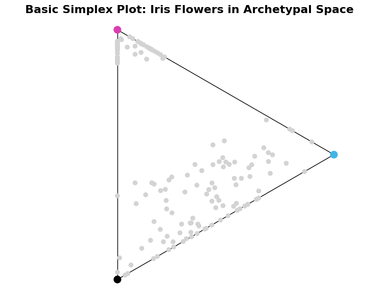
🎯 Quick interpretation:
Each gray dot represents one iris flower
Colored X markers show the three archetypes (corners)
Points near corners are ‘pure’ examples
Points in center are balanced mixtures
🛠️ Simplex Function: Complete Parameter Guide#
The simplex() function offers extensive customization options. Let’s explore each parameter group:
Core Parameters#
points: The mixture coefficients matrix (n_samples × n_archetypes)ax: Matplotlib axes object (optional)
Simplex Structure Controls#
show_axis: Whether to draw the simplex edges (default: True)axis_params: Styling for simplex edges (dict)origin: Center position of simplex (default: (0,0))
Archetype Vertex Controls#
show_vertices: Whether to show archetype markers (default: True)vertices_params: Styling for archetype markers (dict)
Data Point Styling#
**params: All matplotlib scatter parameters (color, size, alpha, etc.)
Let’s demonstrate these with progressively more sophisticated examples:
# Advanced simplex plot with extensive customization
fig, axes = plt.subplots(1, 3, figsize=(24, 6))
axes = axes.ravel()

# 1. Custom axis styling
simplex(
    coefficients,
    show_axis=True,
    axis_params={"color": "lightgrey", "linewidth": 3, "linestyle": "--", "alpha": 0.7},
    ax=axes[0],
)
axes[0].set_title("Custom Simplex Edges", fontweight="bold")

# 2. Custom vertex styling
simplex(
    coefficients,
    vertices_params={
        "c": ["red", "green", "blue"],
        "s": 300,
        "marker": "X",  # Square markers
        "edgecolor": "black",
        "linewidth": 2,
    },
    ax=axes[1],
)
axes[1].set_title("Custom Archetype Markers", fontweight="bold")

# 3. Custom data point styling
simplex(
    coefficients,
    # Color points by their true species
    c=iris.target,
    cmap="plasma",
    marker="s",
    s=50,
    alpha=0.3,
    ax=axes[2],
)
axes[2].set_title("Custom Data Point Styling", fontweight="bold")

plt.tight_layout()
plt.show()
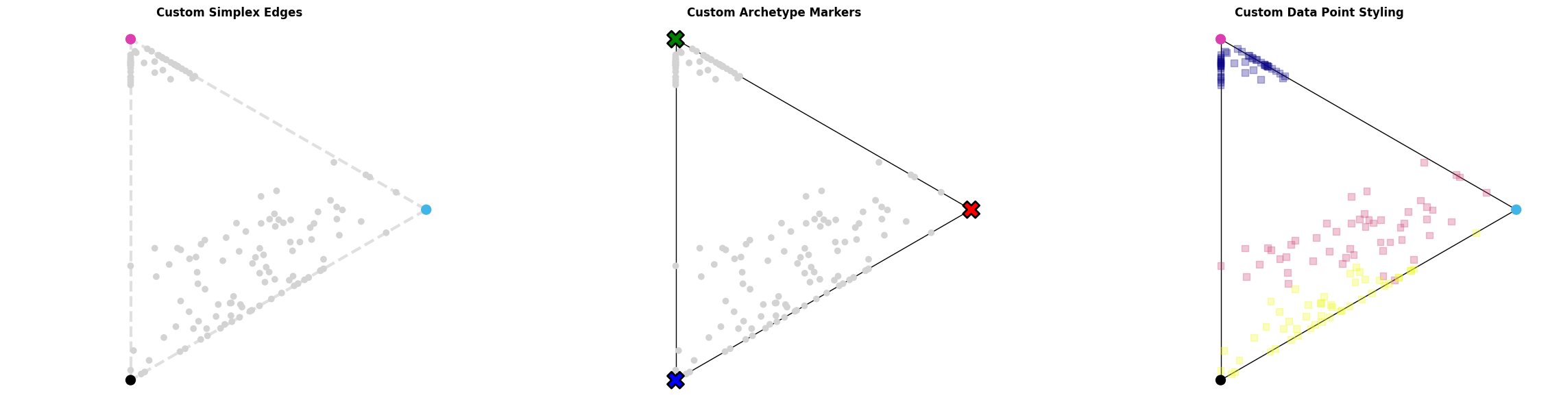
🎨 Styling Options Demonstrated:
Custom simplex edge appearance
Different archetype marker styles
Custom data point colors and shapes
📊 Advanced Simplex Analysis Techniques#
Let’s explore some advanced techniques for extracting insights from simplex plots:
# Advanced analysis: Find and highlight archetypal extremes
fig, axes = plt.subplots(1, 2, figsize=(16, 6))

# Calculate archetypal purity (how close to pure archetypes)
max_similarity = np.max(coefficients, axis=1)
dominant_archetype = np.argmax(coefficients, axis=1)

# Left plot: Size points by purity
simplex(
    coefficients,
    s=max_similarity**2 * 100,  # Size proportional to purity
    c=dominant_archetype,
    alpha=0.5,
    vertices_params={"s": 200},
    ax=axes[0],
)
axes[0].set_title("Archetypal Purity", fontweight="bold")
axes[0].legend(loc="upper right")

# Add explanatory text
textstr = "\n".join(
    [
        "Larger points = more pure\n(closer to a single archetype)",
    ]
)
props = dict(boxstyle="round", facecolor="whitesmoke", alpha=0.8)
axes[0].text(
    0.6, 0.2, textstr, transform=axes[0].transAxes, fontsize=10, verticalalignment="top", bbox=props
)


# Right plot: Identify most extreme examples
# Find most pure examples of each archetype
pure_examples = []
for i in range(3):
    # Find the most similar to archetype i
    most_similar_idx = np.argmax(coefficients[:, i])
    pure_examples.append(most_similar_idx)

# Regular simplex plot
simplex(coefficients, alpha=0.3, ax=axes[1], vertices_params={"s": 200, "alpha": 0.1})
simplex(
    coefficients[pure_examples],
    marker="*",
    s=100,
    c=[0, 1, 2],
    show_vertices=False,
    zorder=2,
    ax=axes[1],
    label="Purest Observations",
)

axes[1].set_title("Highlighting Purest Examples", fontweight="bold")
axes[1].legend(loc="upper right")

textstr = "\n".join(
    [
        "Stars = most archetypal\nexamples of each archetype",
    ]
)
props = dict(boxstyle="round", facecolor="whitesmoke", alpha=0.8)
axes[1].text(
    0.6, 0.2, textstr, transform=axes[1].transAxes, fontsize=10, verticalalignment="top", bbox=props
)

plt.tight_layout()
plt.show()
🔍 Purity Analysis:
Average purity: 0.713
Most pure overall: 1.000
Least pure (most mixed): 0.360
⭐ Purest examples of each archetype:
Archetype 1: Flower #60 (versicolor, purity: 0.898)
Archetype 2: Flower #22 (setosa, purity: 1.000)
Archetype 3: Flower #117 (virginica, purity: 1.000)
📊 Stacked Bar Charts: Composition Analysis#
While simplex plots show geometric relationships, stacked bar charts excel at showing detailed compositional breakdowns. They’re perfect for:
Key Advantages:#
Individual inspection: Examine each data point’s exact composition
Ranking by purity: Easily identify most/least pure examples
Transition patterns: See gradual changes between archetypal regions
Quantitative precision: Read exact percentage contributions
When to Use Stacked Bars vs Simplex:#
Simplex: Overall patterns, clustering, geometric intuition
Stacked bars: Precise composition, individual analysis, ranking
Let’s start with basic stacked bar visualizations:
# Basic stacked bar chart
fig, ax = plt.subplots(figsize=(14, 6))

idx = np.random.choice(range(coefficients.shape[0]), size=30, replace=False)
# Show 30 random flowers for clarity
stacked_bar(coefficients[idx], cmap=cmap, ax=ax)

ax.set_title("Stacked Bar Chart: Archetypal Composition of Flowers", fontsize=16, fontweight="bold")
ax.set_xlabel("Flower Index")

plt.tight_layout()
plt.show()
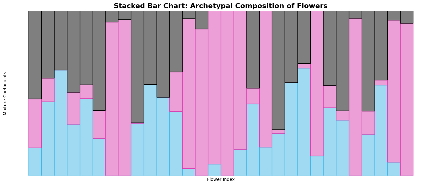
📊 Reading the chart:
Each bar represents one flower
Bar height = 1.0 (all compositions sum to 100%)
Colors show archetypal contributions
Taller color segments = stronger resemblance to that archetype
🛠️ Stacked Bar Function: Parameter Reference#
The stacked_bar() function provides several customization options:
Core Parameters#
points: The mixture coefficients matrix (n_samples × n_archetypes)ax: Matplotlib axes object (optional)
Styling Parameters#
color: Colors for each archetype (list or string)edgecolor: Edge colors for barswidth: Bar width (default: 1)**params: Additional matplotlib bar parameters
Let’s demonstrate these customization options:
# Advanced stacked bar customizations
fig, axes = plt.subplots(3, 1, figsize=(16, 12))

# 1. Custom colors
stacked_bar(coefficients[idx], color=["crimson", "forestgreen", "royalblue"], ax=axes[0])
axes[0].set_title("Custom Color Scheme", fontweight="bold", pad=20)
axes[0].set_ylabel("Composition")

# 2. With custom edge colors for better separation
stacked_bar(
    coefficients[idx],
    color=["crimson", "forestgreen", "royalblue"],
    edgecolor=["darkred", "darkgreen", "darkblue"],
    width=0.8,  # Narrower bars
    ax=axes[1],
)
axes[1].set_title("With Edge Colors and Custom Width", fontweight="bold", pad=20)
axes[1].set_ylabel("Composition")

# 3. Using sorted data for better pattern recognition
sorted_coefficients, sort_info = sort_by_archetype_similarity(
    coefficients, [coefficients], archetypes
)

stacked_bar(sorted_coefficients, edgecolor="black", ax=axes[2])
axes[2].set_title(
    "Sorted by Archetypal Similarity\n(Shows clear transitions between types)",
    fontweight="bold",
    pad=20,
)
axes[2].set_ylabel("Composition")
axes[2].set_xlabel("Flowers (sorted by archetypal similarity)")

plt.tight_layout()
plt.show()
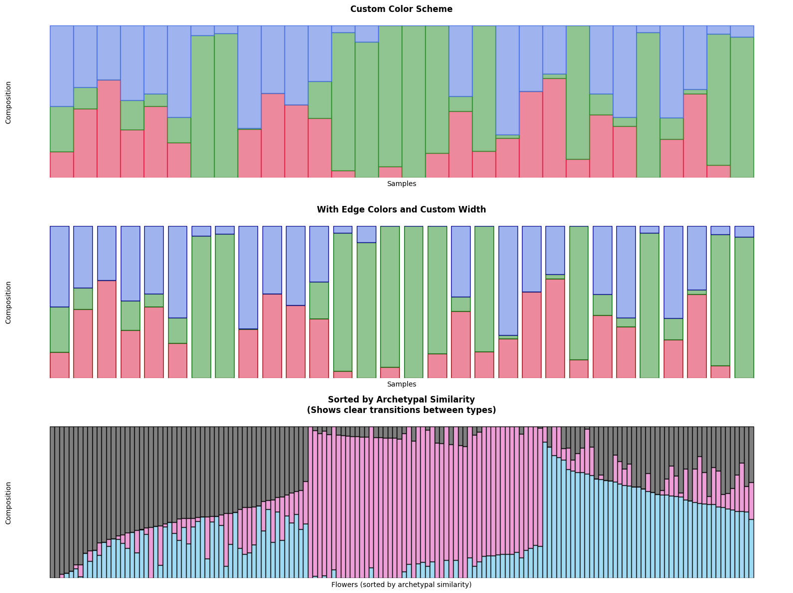
🎨 Customization benefits:
Custom colors improve visual distinction
Edge colors help separate contributions
Sorting reveals archetypal progression patterns
📈 Advanced Stacked Bar Analysis#
Let’s explore some advanced techniques for extracting insights from stacked bar charts:
# Advanced analysis: Identify interesting patterns
fig, axes = plt.subplots(2, 2, figsize=(16, 10))
axes = axes.ravel()

# 1. Most pure examples (high max similarity)
pure_indices = np.argsort(max_similarity)[-20:]  # 20 most pure
pure_coefficients = coefficients[pure_indices]
stacked_bar(pure_coefficients, ax=axes[0])
axes[0].set_title("20 Most Archetypal Pure Examples", fontweight="bold")

# 2. Most mixed examples (low max similarity)
mixed_indices = np.argsort(max_similarity)[:20]  # 20 most mixed
mixed_coefficients = coefficients[mixed_indices]
stacked_bar(mixed_coefficients, ax=axes[1])
axes[1].set_title("20 Most Mixed Examples", fontweight="bold")

# 3. Examples from each species
species_coefficients = []
for species_idx in range(3):
    species_mask = iris.target == species_idx
    species_data = coefficients[species_mask][:15]  # First 15 of each species
    species_coefficients.append(species_data)

combined_species = np.vstack(species_coefficients)
stacked_bar(combined_species, ax=axes[2])
axes[2].set_title("By Species: 15 each of Setosa|Versicolor|Virginica", fontweight="bold")

# Add vertical lines to separate species
axes[2].axvline(14.5, color="black", linestyle="--", alpha=0.7)
axes[2].axvline(29.5, color="black", linestyle="--", alpha=0.7)

# 4. Highlight transition examples (balanced mixtures)
# Find examples that are roughly balanced between archetypes
balance_score = np.std(coefficients, axis=1)  # Low std = more balanced
balanced_indices = np.argsort(balance_score)[:30]  # 30 most balanced
balanced_coefficients = coefficients[balanced_indices]
stacked_bar(balanced_coefficients, ax=axes[3])
axes[3].set_title("30 Most Balanced (Transitional) Examples", fontweight="bold")

plt.tight_layout()
plt.show()
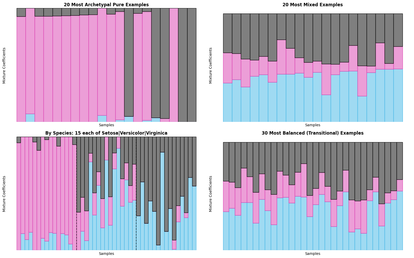
🔍 Pattern Analysis:
Pure examples: Clear dominance by single archetype
Mixed examples: More balanced contributions
Species patterns: Each species shows distinct archetypal signature
Transitional examples: Represent ‘hybrid’ forms
🎯 Combined Analysis: Simplex + Stacked Bars#
The real power comes from combining both visualization types! Let’s create comprehensive analytical views that leverage the strengths of each approach:
Best Practices for Combined Analysis:#
Use simplex for overview → patterns, clusters, outliers
Use stacked bars for details → precise compositions, rankings
Cross-reference findings → validate patterns across both views
Interactive exploration → identify interesting points in simplex, examine in detail with stacked bars
# Comprehensive combined analysis
fig = plt.figure(figsize=(20, 12))

# Create custom layout
gs = fig.add_gridspec(3, 3, height_ratios=[2, 1, 1], width_ratios=[1, 1, 1])

# Top row: Two simplex views
ax1 = fig.add_subplot(gs[0, 0])
ax2 = fig.add_subplot(gs[0, 1])
ax3 = fig.add_subplot(gs[0, 2])

# Simplex 1: Color by species (ground truth)
simplex(
    coefficients,
    c=iris.target,
    s=60,
    alpha=0.7,
    vertices_params={"c": "black"},
    ax=ax1,
)
ax1.set_title("Simplex: Colored by True Species", fontweight="bold")

# Simplex 2: Color by archetypal purity
simplex(
    coefficients,
    c=max_similarity,
    cmap="viridis_r",  # Sequential colormap for purity
    s=60,
    alpha=0.7,
    vertices_params={"c": "black"},
    ax=ax2,
)
ax2.set_title("Simplex: Colored by Purity", fontweight="bold")

# Simplex 3: Size by purity, color by dominant archetype
simplex(
    coefficients,
    c=[i for i in dominant_archetype],
    s=max_similarity**2 * 100,
    alpha=0.6,
    ax=ax3,
)
ax3.set_title("Simplex: Colored by Dominant Archetype", fontweight="bold")

# Middle row: Stacked bar - sorted by archetypal similarity
ax4 = fig.add_subplot(gs[1, :])
stacked_bar(sorted_coefficients, ax=ax4)
ax4.set_title("Stacked Bars: All Flowers Sorted by Archetypal Similarity", fontweight="bold")
ax4.set_ylabel("Composition")

# Bottom row: Focused stacked bars
ax5 = fig.add_subplot(gs[2, 0])
ax6 = fig.add_subplot(gs[2, 1])
ax7 = fig.add_subplot(gs[2, 2])

# Pure examples for each archetype
for arch_idx in range(3):
    # Find examples with high similarity to this archetype
    arch_similarity = coefficients[:, arch_idx]
    top_indices = np.argsort(arch_similarity)[-15:]  # Top 15
    arch_examples = coefficients[top_indices]

    ax = [ax5, ax6, ax7][arch_idx]
    stacked_bar(arch_examples, ax=ax)
    ax.set_title(f"Top 15 Similar to Archetype {arch_idx+1}", fontweight="bold", fontsize=10)
    ax.set_xlabel("Examples", fontsize=9)

plt.tight_layout()
plt.show()
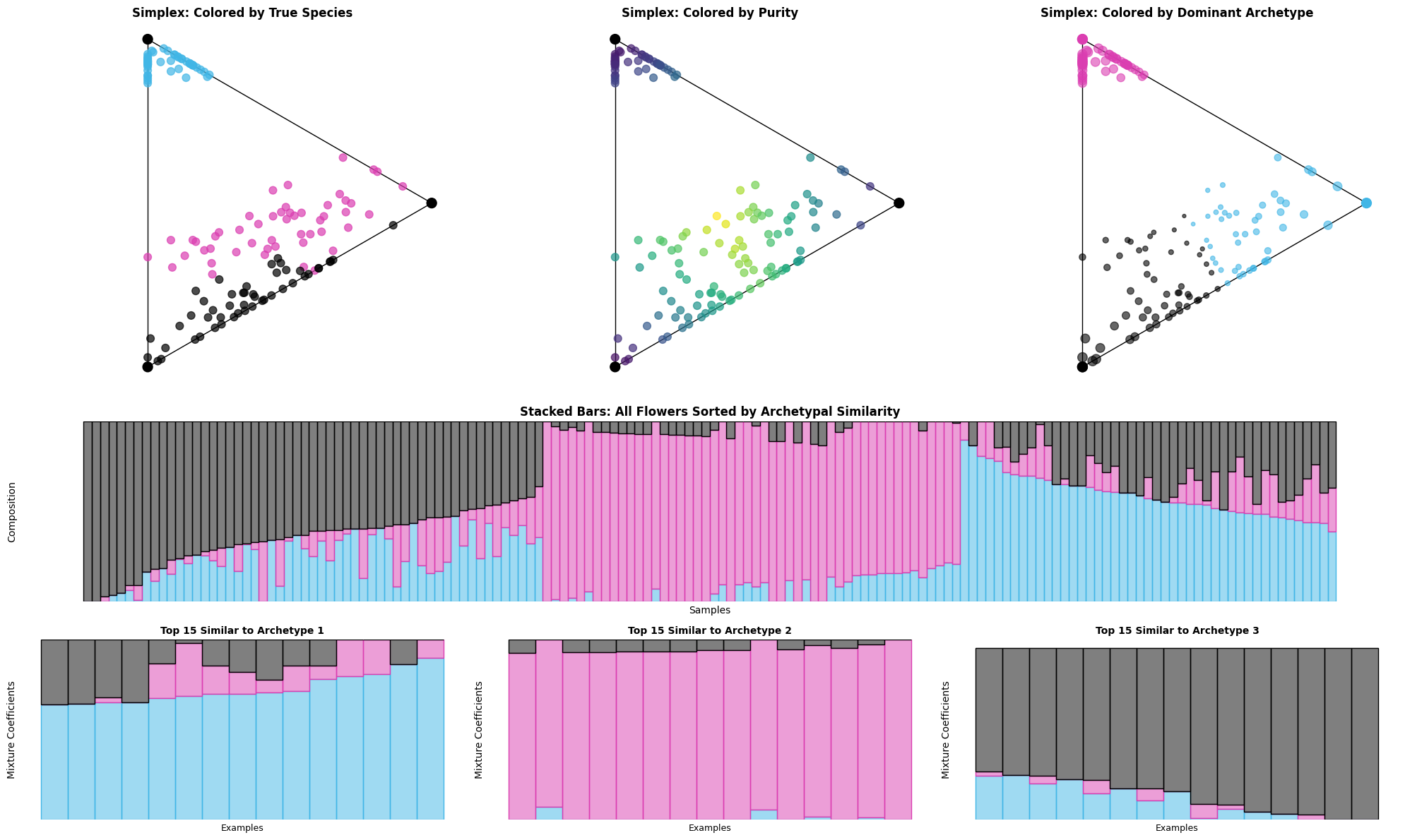
📐 Simplex plots reveal:
Overall archetypal structure and clustering patterns
Relationship between species and discovered archetypes
Distribution of purity across the dataset
📊 Stacked bar charts show:
Precise archetypal compositions for each flower
Clear transitions between archetypal regions
Most representative examples of each archetype
🔄 Combined insights:
Species correspond well to archetypal clusters
Some flowers are archetypal ‘hybrids’
Clear archetypal hierarchy exists in the data
🎓 Key Takeaways#
Congratulations! You’ve mastered the art of archetypal analysis visualization. Here’s what you’ve learned:
🔑 Core Visualization Concepts#
Simplex plots: Geometric representation revealing archetypal relationships
Stacked bar charts: Precise compositional analysis and ranking
Combined analysis: Leveraging strengths of multiple visualization types
Progressive disclosure: Building complexity gradually for better understanding
🛠️ Technical Skills Acquired#
Function mastery: Complete control over
simplex()andstacked_bar()parametersColor management: Professional color schemes using
set_cmap()andpypalettesAdvanced styling: Custom markers, colors, sizes, and annotations
Data sorting: Using
sort_by_archetype_similarity()for better patterns
📊 Analytical Techniques#
Purity analysis: Identifying most/least archetypal examples
Pattern recognition: Spotting clusters, transitions, and outliers
Cross-validation: Using ground truth labels to validate discoveries
Interactive exploration: Moving between overview and detail views
🎯 When to Use Each Visualization#
Visualization |
Best For |
Key Strengths |
|---|---|---|
Simplex Plot |
• Overall patterns |
• Natural archetypal space |
Stacked Bar |
• Precise compositions |
• Quantitative precision |
🚀 Next Steps#
Ready to apply these techniques to your own data? Here are your next adventures:
📚 Advanced Techniques#
Interactive visualizations: Add
plotlyfor web-based explorationAnimation: Show archetypal evolution over time or iterations
Custom layouts: Design domain-specific visualization dashboards
🎨 Visualization Extensions#
Network plots: Show relationships between archetypal regions
Heatmaps: Display archetypal similarity matrices
Time series: Track archetypal evolution over time
Geographic plots: Map archetypal patterns to geographic regions
Happy visualizing! 🎉
Remember: Great visualizations don’t just show data – they reveal insights that guide better decisions.